

Design Sprint
House to Home
Role
UX/UI Designer
Research, Design, Testing
Time Frame
One Week
Company
Springboard UX/UI Design Career Track
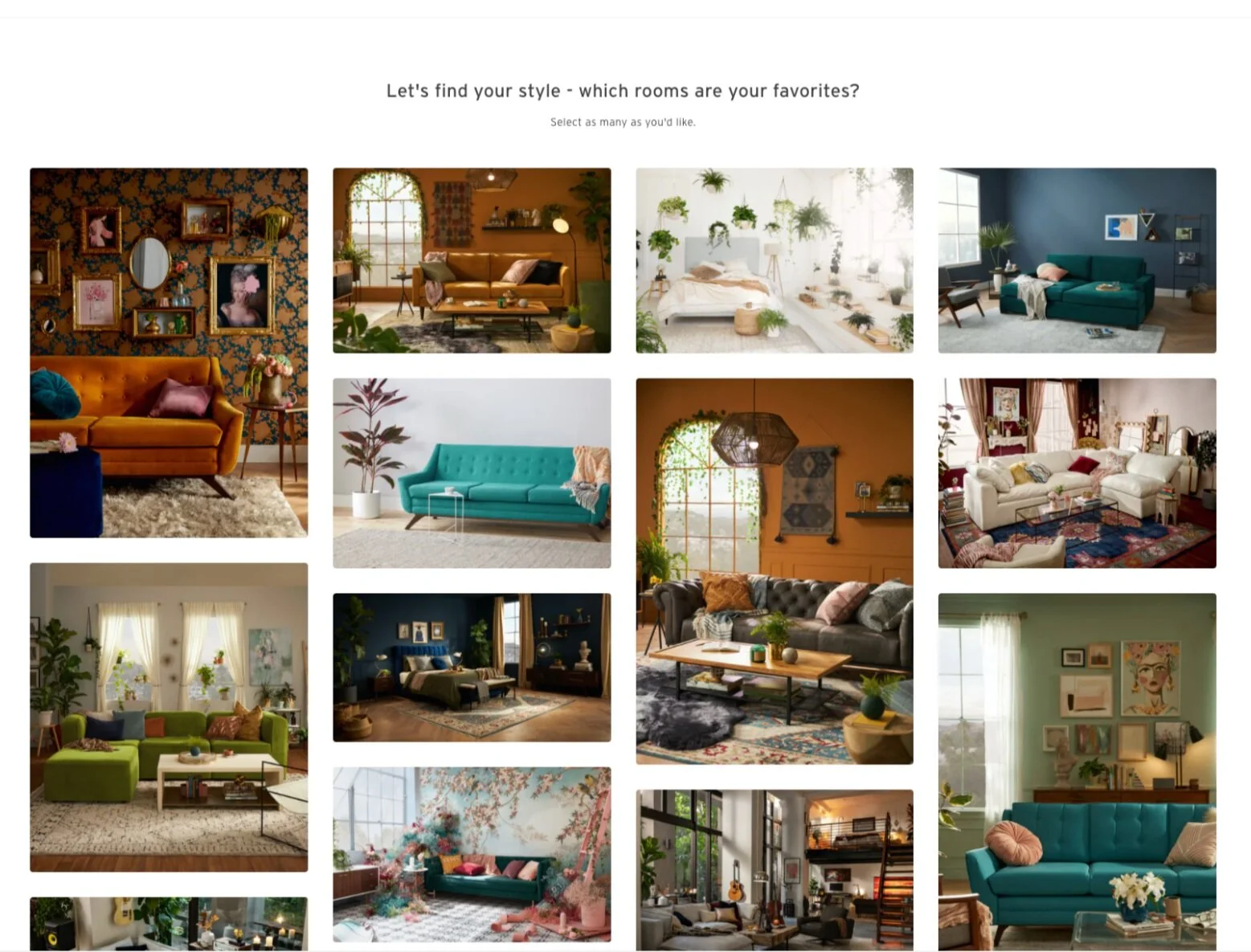
The goal of this project was to help people who have just moved into a new home or apartment and want to decorate it to make it their own, but don’t feel confident in doing it themselves.
High-level goals:
Provide “starter kits” for new homeowners/renters
Provide flexibility to build their own “starter kits”
Allow users to stay on budget
Problem:
How might we help users design their new apartment or home when they don’t feel confident doing it themselves, all while helping them stick to a budget?
Audience:
Those who have just moved into a new house or apartment
Research
Lightning Demos
I studied three different websites that all provide customers with “packages” of products that were suggested to them based on their likes and dislikes. All three had a questionnaire the user filled out to determine their likes, dislikes, budget, etc., and would then use these choices to offer purchase suggestions. The first was an interior decorating site and the other two sites were clothing retailers.
Joybird
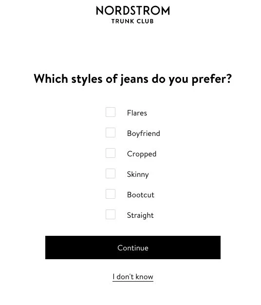
Nordstrom Trunk Club
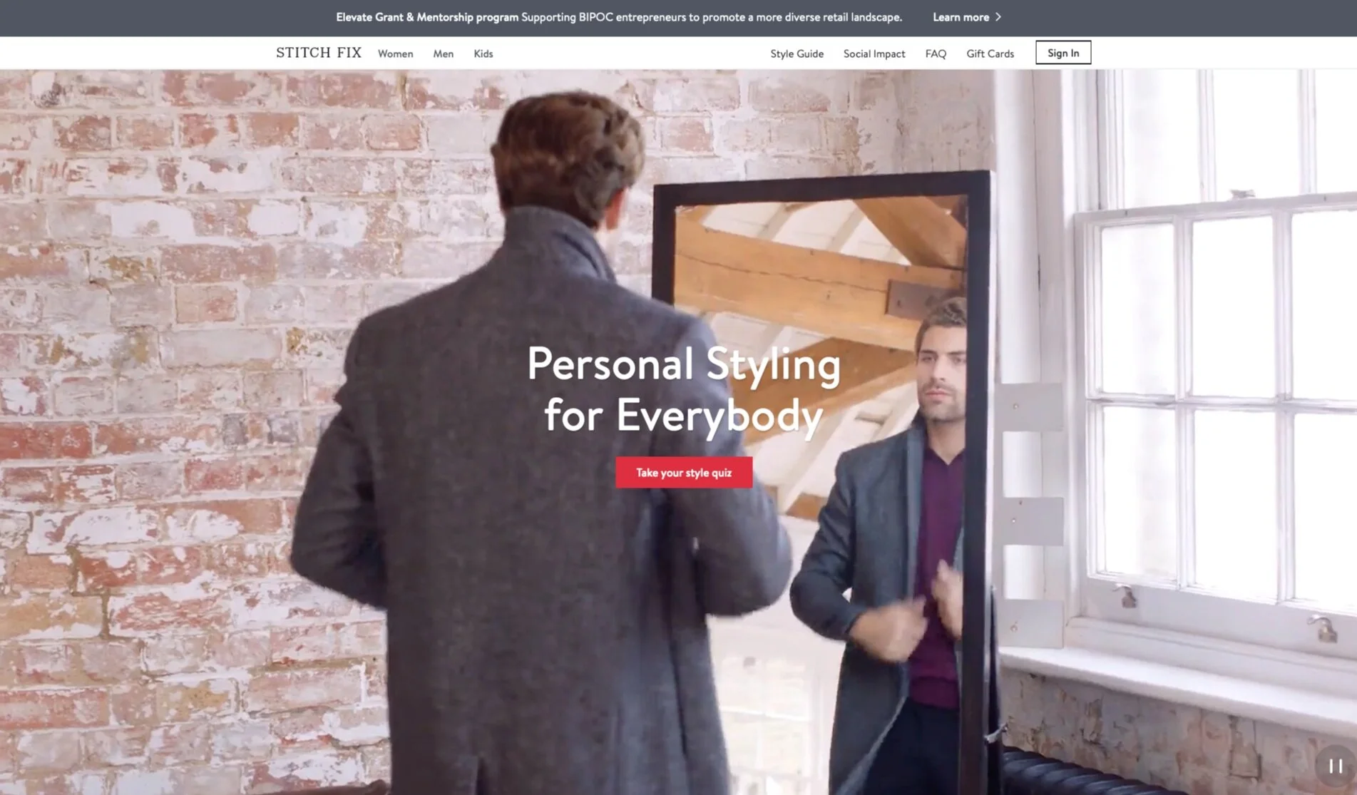
Stitch Fix
Design and Ideation
Sketches
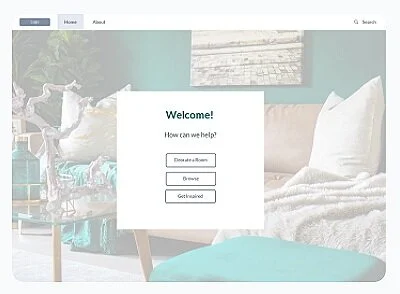
The critical screen I chose was the “view items for sale” screen. This page is crucial because it takes all of the information from the previous questionnaires and formulates ideas to present as a suggested “starter kit” to the user. I decided that it could be presented to the user in the following forms:

E-commerce platform


User could upload a photo of their empty space to place the suggested objects in

View a virtual room with the budget, style and colors that are based on the earlier questionnaires.


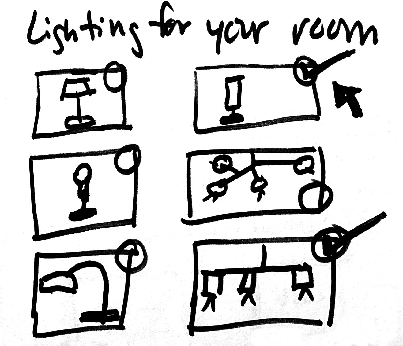
Solution Sketch
View a virtual room with the budget, style, and colors that is based on the earlier questionnaires

The first (top) screen provides you with the opportunity to review your choices you made from the questionnaires.
The second screen is a photo of a room with your chosen style, color, and budget in mind. From here you can see what items are suggested for your room with the option of clicking on each item and choosing an alternative.
The third screen presents you with alternatives to the items chosen for you.
Storyboard
The site provides the user with options to choose the style and color they are looking for, as well as what room they are going to decorate and their budget. The following screens show those selections being made and then the items shown in the virtual room. When the room appears you can choose the item and then swap that item out for a different option. You’ll then have a list of all of your items and you can add them to your cart.


High Fidelity Mockups


Prototype
Moderated Usability Tests
The five usability tests I conducted were all moderated, 3 of which were remote and conducted through Skype. I tested the critical functions of the site which allows the user to create a decorating starter kit, starting with the user choosing the style they like through to the checkout screen.
There were 2 main issues discovered in the usability tests:
Keep Shopping: Most of the users mentioned that they expected to see a link on the checkout page that would take them back so they could add more items to their cart. They mentioned that since there is a summary of how much they have left to spend based on their budget, they should be able to easily go back and add more items to buy.
I decided to add an option to continue shopping on the checkout page, underneath the amount left to spend in total.

Review your choices: Users felt confusion and a lack of control on this screen. One user asked what they should do if they wanted to change any of the choices they had made.
I realized I needed to provide a way for the user to change any of their choices in the form of a “go back” or “change” link for each of the categories as well as provide category names on the “Choose Your Style” page.
