

Internship
Capsul
Role
UX/UI Designer
Research, Design, Testing
Time Frame
Five Weeks
Company
Capsul Jewelry
The goal of this project was to increase Capsul Jewelry's conversion rates and to improve sales as a result.
High-level goals
Decrease the drop-off percentage
on the product page to the cart.
Problem:
How might we help users create a customized piece of jewelry in a way that is streamlined, fun, and easy to understand?
Audience:
Women and men ages 25-45 who are looking to purchase jewelry for themselves or as a gift.
Research
My UX Design team and I collected data provided to us through Google Analytics and then conducted usability testing on the existing website, both desktop, and mobile, to help discover where the pain points for the users are.
With Analytics we discovered:
There is a 50% drop off between cart and shipping
Based on the traffic route data, users are moving back and forth between the landing page and the collections page.
75% of customers are mobile users
With usability testing we discovered:
There was confusion with the metal choices offered and the customization features
There were issues with navigating from the landing page to the collections page
From this information we initially chose to address:
Navigating from the landing page to help customers more efficiently find what they are looking for.
The metal customization flow in order to boost customers’ confidence and potentially expedite them to cart.
Personas
From our research, we were able to create our persona, Rebecca.

Journey Mapping
After synthesizing the data and creating our persona, we created a journey map for Rebecca.
Our journey map helped us to visualize what the user is experiencing throughout the process, starting with clicking on a Capsul ad on Instagram, through to adding a necklace to their cart, and we came across the following pain points:
The user finds that there are a lot of product photos to browse through and they do not seem to recognize what metal is being shown and cannot see the details of the necklace engravings.
The user is unsure what the difference is between a base metal and a finish and wonders if they are the same thing.
The user is uncertain about the upload feature.
What can I upload
Are there size limitations?
Can I take a photo?
When the product is added to the cart, the user often feels uncertain whether or not they did the process right and if they will get what they think they ordered.
After synthesizing our research data, we decided that creating a new flow for the Product Page through product customization and adding to the cart would be the most beneficial to the client and would help decrease drop-off rates.

Design and Ideation
User Flow
The user flow starts at the Product Page of the Custom ID Necklace and walks the user through choosing a color and finish first and then choosing a base metal. Customization then begins with choosing an engraving option for the front, creating your personalized engraving, then choosing an engraving option for the back of the necklace, and then creating that engraving. The user will then be able to review their choices and then add to bag.

Sketching
We began our design process by conducting Crazy 8 sketches and having each member of the team vote on which aspects of the ideas we liked the most. Then we began compiling those ideas into one flow.

From that information we created sketches and ideated further on those.

Wireframes
Using Figma and taking in mind the results of the Crazy 8’s and our sketches, we created the following wireframes.


Usability Tests
We ran a second usability test on our new wireframes. We ran 5 remote tests with users aged 25-45.
We gave them two tasks:
Create a Custom User ID Necklace in gold with a Soundwave for front design and Handwriting for the back. And a budget of $250 to spend.
Create a Custom User ID Necklace in gold with a Roman Numeral Date for the front design and using a Script Font create a message for the back. And a budget of $250 to spend.
Findings:
Users were confused with the option for “engraving” for the front design of the necklace.
Technically, these options are all engravings so it wasn’t clear to why this option of engraving would be different from the others.

Users weren’t clear if the engraving was an additional cost
The option below would make it easier for users to complete the purchase with this transparency.

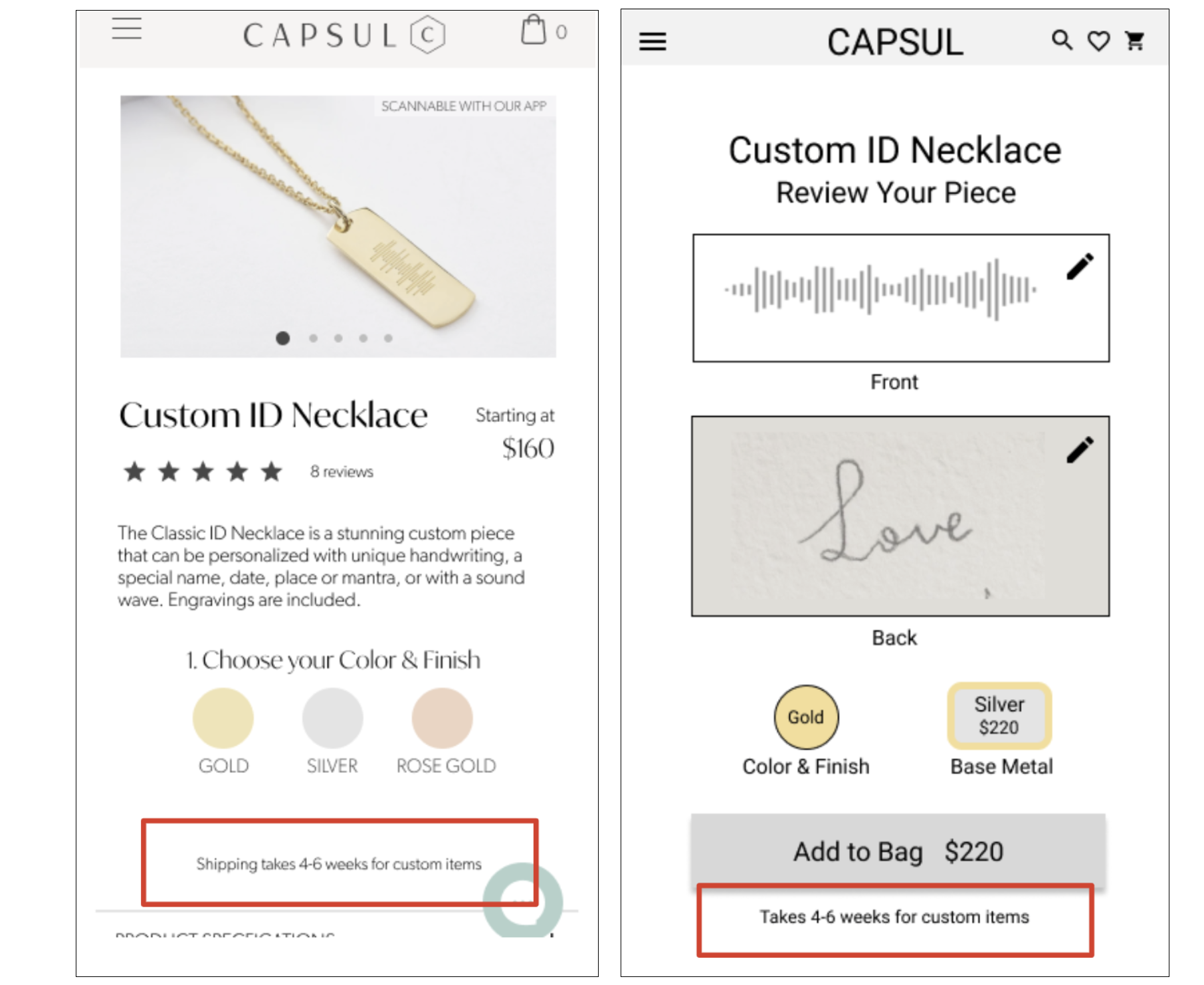
They didn’t realize that the shipment of a custom product would take 4-6 weeks until the end of the customizing process.
This will help them make a more informed decision if this item would be right for them given the time frame to deliver the product.
High Fidelity Mockups
Using the wireframes and applying the branding and style guide, we created high fidelity mockups using Figma.

Final Moderated Usability Tests
Users were confused about the icons and labels for the back engravings. They were unsure if a script font would be located under “Handwriting”. Some users also thought there would only be one font available under “Our Font”.
Changed “Our Font” to “Our Fonts”
Changed “Handwriting” to “Your Handwriting”

Customers wanted clarity with the customize later feature.
In the modal, we clarified they would be contacted after purchase instead of “upon purchase”, removed the “x” and added the ok CTA button.

Outcomes and results
In this final test, with the exception of the changes made above, the users seemed to not experience any problems with the earlier issues and the tests ran smoothly.
Moving forward, we recommended the client add the ability for the users to see a digital representation of the piece they created when financially possible. This came up often in our user testing, so we saw it as a benefit for both the user and the client. We also recommended that if she wanted to move forward with the option of purchasing the jewelry first and then customizing, she should do further research and user testing to see if this is a viable solution.