Capstone Two
Exercise Tracking
Role
UX/UI Designer
Research, Design, Testing
Time Frame
One Month
Company
Springboard UX/UI Design Career Track
The goal of this project was to help design new messaging features that create sustained engagement in an existing exercise tracking app. My goals were to create the opportunity for users to message each other with health and fitness goals and achievements and to create an integrated messaging experience throughout the product that drives engagement and repeat usage.
Problem:
How might we provide users with the ability to communicate with their family and friends about their health, fitness goals, and activities?
Audience:
Very tech-savvy — they are on their phones for several hours a day
Very budget-conscious
Messaging and communicating with friends and family is a very important part of their daily lives
18-34 years old
Research
Online secondary research on competitive products
Research questions:
What causes users to disengage?
What keeps users motivated?
Do users like to share their progress and accomplishments?
How do users feel about competing with others?
Are users curious about others’ progress?

1) Nike Run Club
Add friends by searching your email contacts and doing a name search on the app
Compare and compete with your friends/group
Messaging Inbox system
Unable to share achievements
2) MapMyRun
Invite friends through text or email
Search for friends by name through the app
App suggests friends
Social networking platform
3) FitList
Social networking platform
Friends search
Cannot invite friends
No direct messaging system
No ability to share stats
Research Results
Retention
A commonality I found in my research is that studies have shown that people who enroll in health improvement programs have more success and stick with the programs if they have a friend doing it along with them. Some of the benefits of group workouts are more motivation, less likely to get bored, more likely to stick to commitments, and more likely to limit your own negative self-talk.
Why People Quit
There are 4 main reasons people give up on their workout routines:
Perceived lack of time/too busy
No accountability or consequences to quitting.
Unrealistic expectations - starting too big too quickly
Unenjoyable workouts
Proposed Features Based on Research
Add a separate messaging feature for members to compose messages to friends
Add an ability to send invitations to friends to join a club with you
Add an ability to share your exercise stats with a friend(s) and either add pre-composed messages, write your own message, or both.
Design and Ideation
User Flows
These user flows walk a person through three tasks: composing a new message to a friend, inviting a friend to join a club, and sharing their workout stats with a friend.


Sketches
Through sketching, I wanted to incorporate opportunities to resolve the issues mentioned in the provided wireframes. The main question revolved around how to integrate messaging features within the existing features. I decided to create ways for users to direct message each other, join clubs together, and share their exercise achievements with the intention that these tasks would drive user engagement and repeat usage.
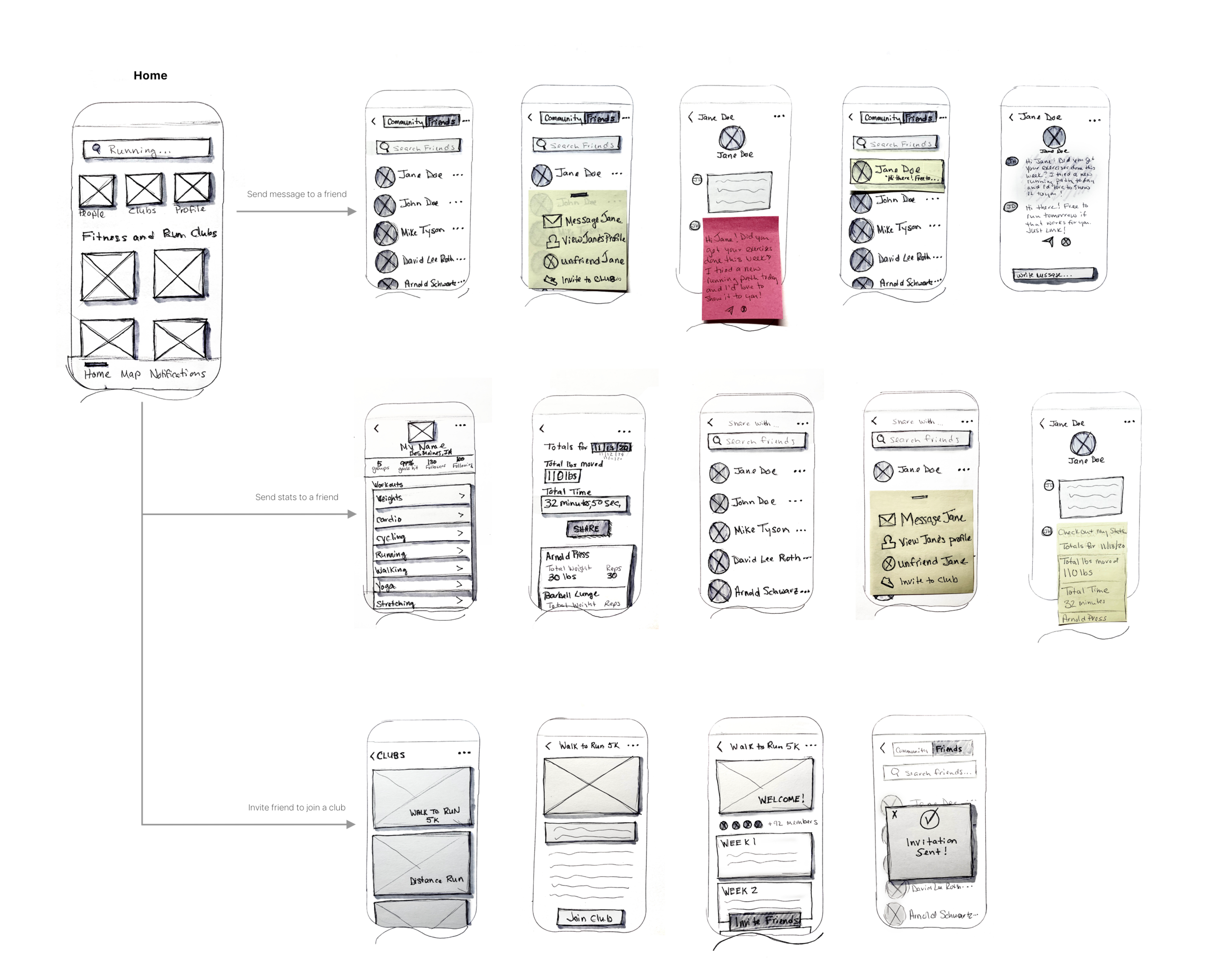
Wireframes
Lightweight wireframes of the “existing product” were provided and gave me a starting point to build from.

Branding and Style Guide
I wanted to inspire people to exercise with their friends and family and have fun doing it. The experience should be fun, inspiring, and simple to use. The colors, elements, imagery, and UI patterns I chose represent all of these things.

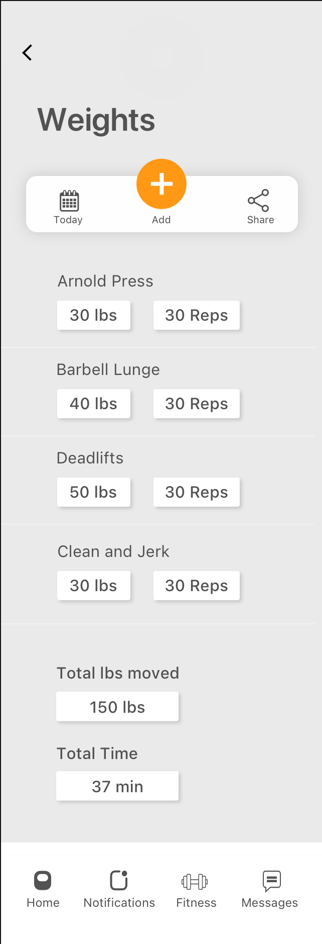
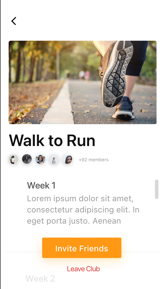
High Fidelity Mockups
High fidelity mockups were created using the provided wireframes as a starting point and applying the branding and style guide.


Prototype

Moderated Usability Tests
I conducted two rounds of usability tests. The goal of the first test was to discover the user’s initial impressions of the communication features and to uncover any usability problems. Features tested: how to share your stats with a friend, how to write a message to a friend, and how to invite a friend to join a club with you. Goals of the second test were to validate those findings.
There were 6 main issues discovered in the usability tests:
Message Notifications: Users questioned what the “Notifications” feature was for.
I decided to create a separate messaging feature.

Sharing Stats: Users mentioned that they might want to share their stats with more than one person and they wanted to be able to pick and choose what they wanted to share.
I created an ability to select which stats you want to share and an ability to share with more than one person. I also kept the ability to share stats and the messaging features separate.

“People” tab: I heard users say, “I guess I should try the People tab” when looking for friends.
I decided to change the name to “My Friends” so it is more clear to the user.

Messaging Icon: Two users questioned the location and function of the “X” and airplane icons located under the message.
I moved the message icon down into the message box and removed the X completely.

Map: Users didn’t understand what the “Map” feature was for. The Map feature was included in the original wireframes provided.
I decided to delete it since it had no relevance to the communications features I integrated and it was confusing for the user.

Clubs: Users stated it seemed redundant to have a Clubs tab at the top and then Fitness and Running Clubs below. These features were integrated into the original wireframes.
After receiving feedback from user testing, I decided to remove the “Clubs” tab at the top.

After making the changes above, I ran a second usability test to validate.
Share Stats task: There was confusion for all users with the sharing stats feature. All users thought the “Next” button was confusing and didn’t initially realize that the first page had sharing functionality.
I changed the term “Next” to “Share” and created a separate page for their workout stats and their share page.


Sending a Message: Users thought it was too many steps to send a message and were looking for a different option to send a group text.
I eliminated some steps when sending a message and created a separate option to send a group message.

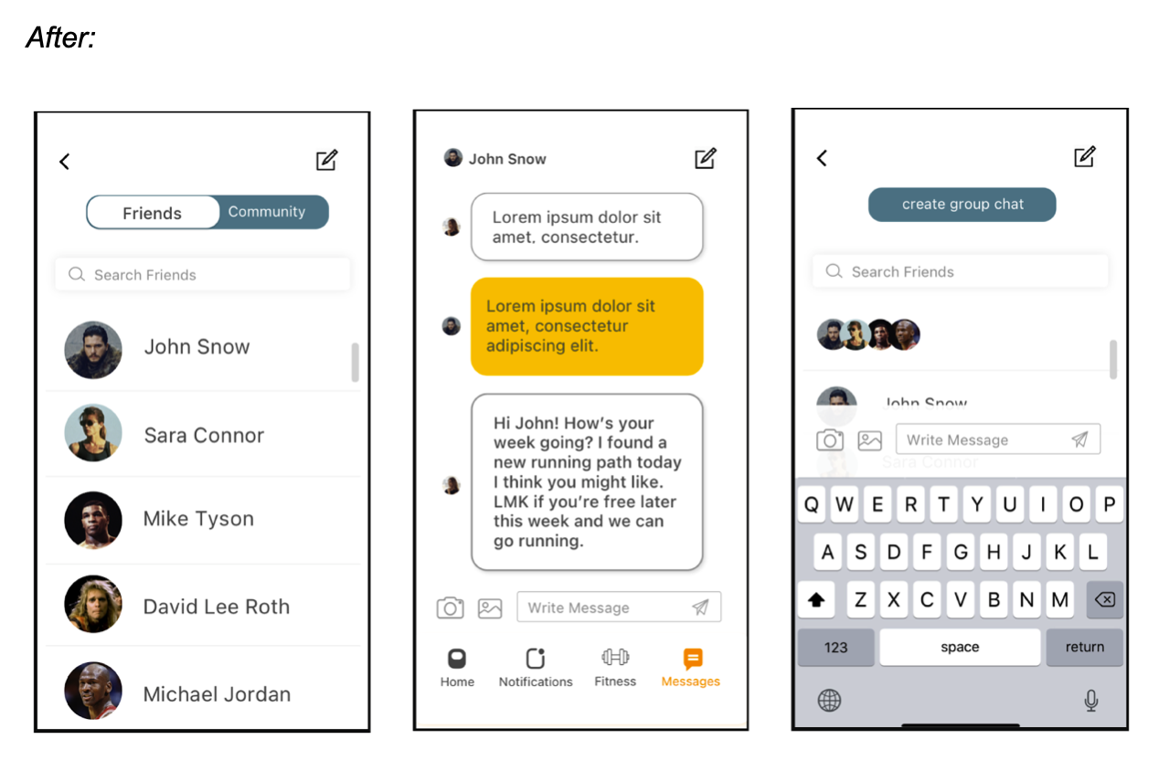
After analyzing the results from the second round of testing, I created the final mockups.
Final High Fidelity Mockups